Daisyworld Simulation
I’ve previously written about James Lovelock’s Daisyworld, a thought-experiment meant to support the Gaia Hypothesis. This is the idea that complex ecosystems create a self-regulating environment conducive to perpetuating life. Examples of this include increased plant growth reducing CO2 in the atmosphere or bacteria drawing salt out of the oceans stabilizing salinity levels.
Ten years ago, I was enamored with the hypothesis, but am much more skeptical now seeing it tested on our own planet. With rising CO2 levels, fertilizer runoff effects, plastic, and other pollutants impacting ecosystems across the Earth, I only see destabilizing feedbacks as a result. Yes, the environment could become so destabilized as to kill the human race and let nature evolve new ecosystems–a pessimistic view I don’t share as I believe we are smarter than the challenges we face–but such an outcome is easier explained with straightforward evolution and adaptation.
My skepticism aside, I still love Lovelock’s planetary fable as something to ponder. Daisyworld is a planet covered in white and black daisies. When there are too many white daisies, the planet gets colder as more light is reflected into space and allows the black daisies to thrive as they absorb more solar radiation. When there are too many black daisies, the planet warms from the solar energy being converted into thermal. Then the white daisies thrive by keeping cool in the heat. Eventually the planet reaches an equilibrium of white and black daisies that maintain a stable temperature in which they can both thrive.
With a model so simple, I realized I could write a javascript/html app to demonstrate it. As with my previous exercises, I found the project more a matter of putting building-blocks together–building on problems others had already solved–rather than coding everything from scratch. In this case, there were two main problem areas (1) calculating planetary surface temperature and (2) algorithmically generating a visual display of the planet itself.
Calculating Surface Temperature
The first problem I was happy to find already solved was all the variables that go into calculating the surface temperature of a planet. Thank you Astronomy StackExchange, which provided the following equation with a down-to-earth explanation:
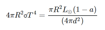
Planetary Temperature Equation
…and even plugged in the values for Earth:
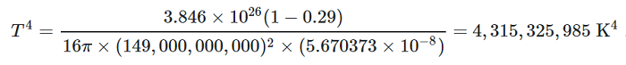
Planetary Temperature Equation with Earth Values
This produces a value of -17° C, with Earth’s average temperature at about 15° C. The discrepancy is explained by the absence of the greenhouse effect, which I guestimated at 1.6 for one Earth because plugging that number into the mix gets me to 15° C.
var distance               = 149000000000 * solarDistance; //In astronomical units

var luminosity             = 3.846 * Math.pow(10, 26) * solarLuminosity;

var albedo                 = planetaryAlbedo; //Earth is 0.29

var stefanBoltzmanConstant = 5.670373 * Math.pow(10, -8)

var greenhouse             = 1.6 * earthGreenhouses; //1.6 guestimated to get Earth's 15C.
var numerator = (luminosity * (1-albedo));
var denominator = (16*Math.PI) * (Math.pow(distance,2)) * (stefanBoltzmanConstant);
var t4 = (numerator / denominator) * greenhouse;
var kelvinTemp = (Math.round(Math.pow(t4, 0.25)*10)/10);
I’m simplifying my explanation here, like not explaining the Stefan–Boltzmann constant, solar distance, and luminosity, but I will say it was immensely fun playing with these variables and watching them interact. The joy of computer programming is learning through experimentation and discovery. It’s seeing an equation in action as a dynamic entity versus working through it on paper.
Algorithmically Generated Worlds
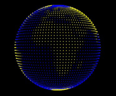
Armed with a planetary-surface-temperature function, the other half of the model was the visualization itself. Once again, hard problems were already solved with this animated spinning globe code-snippet. It works ingeniously by taking a tiny PNG black-and-white map of the world, converting it into an array of pixels, drawing them into the illusion of a sphere, and then adding rotation. Here was the foundation for my planet.

World Map
Globe Points
Secondly, I needed to draw my white-and-black daisies. Again, problem already solved with a search for algorithmically-generated continents. Swapping out water and land for white and black daises, I could gently iterate the populations as temperatures fluctuated. There was a good deal of playing with the algorithm as I tried to keep the daisies in clumps and had them grow and recede smoothly. Again, understanding the algorithm was less effective than simply playing with it.
Algorithmically-Generated Continents
Modeling Daisyworld
Enjoying the process of creation and discovery–learning through experimentation rather than passive consumption of facts–I was also very pleased with the result. There were bugs to work through, like when my white daisies kept coming back from extinction because the code was erroneously leaving one white pixel always alive from which to respawn (In a world without mutation, monocultures don’t come back from the dead (I added a mutation toggle later for this)). There were also the many versions of the planet that just ran away to hot-or-cold death that took much work to stabilize. In the end, I had a fun little explorable explanation for learning about planetary temperatures.
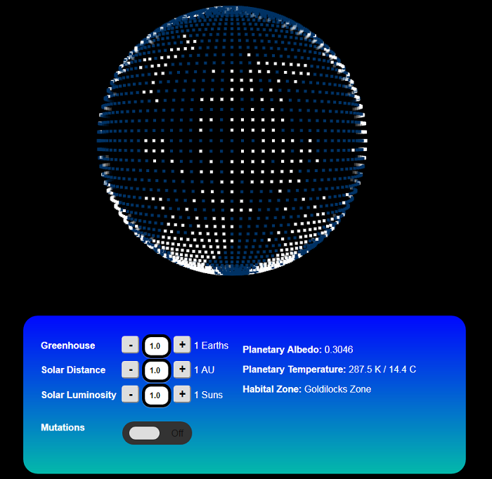
But what about a model for learning about Daisyworld? I’ve created a planet covered in white and black dots that impact the albedo with other variables that impact the planet’s surface temperatures. This is a nice model, but it’s missing the most important piece of data: the daisies.
As I was coding the simulation, I kept thinking about the daisies. In my model, the adjustments are forced. When it’s too cold or hot, the model gently adjusts the daisy populations until things stabilize. But how would that work in real life?
In the thought experiment, black daisies die when it’s too hot and white die when it’s too cold which leaves open space in which their counterparts can grow. But in real life, there are reasons why daisies would evolve black and white colorations as adaptations. White daisies are white because they prefer colder internal temperatures, and black because they need warmer internal temperatures. So, to my mind, these species would actually thrive in the temperatures the model has killing them.
Other variations of this model by others include daisies of variable albedos, like gray. But a daisy is much more than its pigmentation, and an environment is much more than its temperature. State and availability of water and cloud coverage, atmospheric chemical composition, and the myriad of adaptation beyond color are just some of the missing variables that render this model useless for demonstrating the Gaia Hypothesis. In fact, the model is so simplistic as to be absurd.
But this only really became apparent to me when I went through the exercise of building the model itself. For this fact, I think Daisyworld still works as a fun thought experiment. It’s something grade school students can play with. It’s a planetary sandbox without depth. It where a tiny subset of environmental variables can be understood as a launching-point before bringing in additional complexity. Although it fails to make a convincing argument for the Gaia Hypothesis, Daisyworld remains a valuable, fanciful, and engaging critical exercise.
Daisyworld is part of my Explorable Explanations collection of virtual manipulatives.