“It is easy to lie with statistics; it is easier to lie without them.” – Frederick Mosteller
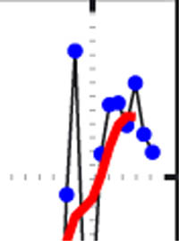
Global Cooling Trend |
Yesterday I posted this image of what climatologists are claiming is evidence of warming in the last decade, and explained how it actually shows a cooling trend; however, it has come to my attention that the methodology I used, while completely legitimate in a completely fallacious sense, did violate the scientific principle of Occam’s Razor, which states that the simplest explanation is the most likely.
The problem with this graph is that there are way too many dots on it, making it too complex. A much simpler graph, with fewer dots, would clear things up and show how the world has actually cooled in the last decade.
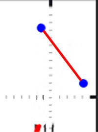
Global Cooling Trend Simplified |
See? Isn’t that cleaner? Easier to understand? Occam’s Razor baby. That’s right. This is what those Global Warming cooks don’t want you to see. How about we apply this principle to the whole last century of temperature data?
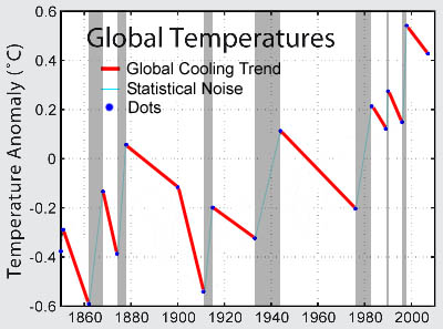
Global Cooling Trend over the Last Century |

Warming |
Where’s your warming now Al Gore? Huh? As we can see from this graph, most of this century has been on a cooling trend. Take all those shaded parts that I’ve so helpfully shaded and all the non-shaded parts that I’ve so helpfully not shaded and put them on a statistical bar graph thing like you see in power point, and look what you get. You get this pic over here to the right, with the red cooling bar being much much bigger, like three times much much bigger than the warming bar.
How can anyone look at this concrete visual data and not see Global Warming’s a crock?
Comments
11 responses to “Clarifying the Science Behind Global Cooling”