I couldn’t take it anymore. Yes, I know white text on black background really cheeses off some people, but I find it easier on the eyes once the pupils open up and adjust to the diminished brightness. I tend to agree with the reasoning that black text on a white background works on paper because paper reflects light; therefore, white text on a black background is preferable on a computer monitor because the light is coming through the monitor, where bright colors bleed over dark ones.
There might also be a bit of an environmental reason for the white text on black background format, and that is energy efficiency. EcoIron estimates a black Google would save 750 Megawatt-hours a Year. The Wall Street Journal had Energy Star’s power-management program ask consulting firm Cadmus Group run a quick test of this claim. They found dark colors conferred a 5% to 20% energy savings on old CRT monitors, but found negligible savings on LCDs.
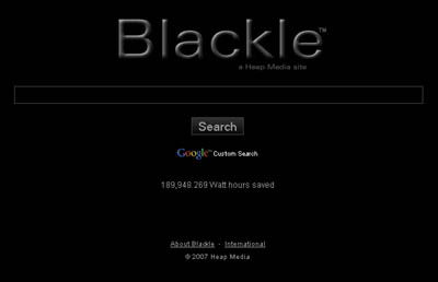
Then there’s Blackle, a black version of google search, which claims to save energy (Hat Tip to Flying Sirkus for the link.). Techlogg researched 27 monitors, comparing their energy consumption on Google and Blackle, also finding significant energy-savings for CRT’s using Blackle; however, they also found Blackle consumed slightly more energy on smaller LCD screens, with most monitors larger than 22-inches consuming slightly less energy on Blackle.
Techlogg’s recommendation for eco-conscious geeks? Reduce your monitor’s refresh rate for the most savings.
 Blackle BlackleThe Energy Star Version of Google? |
Now I’m eager to get ahold of a point-of-use electrical meter and run some tests on this myself. If my blog saves me a little energy, then screw all you envious dwarf-monitor users.
In the meantime, I’ll continue rationalizing this style as a legibility issue, and not a belligerent refusal to change styles from my former life at what I now refer to as ideonexus beta. Besides a page hosted on NASA’s domain seems to indicate that this format is at least acceptably legible.
Not to mention the folks at LaughingSquid use the same format, and they’re a bunch of artists, and, even better, is the design at Pink Tentacle, which I find very easy on the eyes and also benefit from the Cephalopod aesthetic.
Hmmm… I think this site needs a “cephalopod” tag.
Comments
6 responses to “Black is the New Black”