Climate Change 2013: The Physical Science Basis
Credit: IPCC
Weighing in at over 1,500 pages, surveying the results from thousands of journal articles, and written by 259 experts from fields including meteorology, physics, oceanography, statistics, engineering, ecology, social sciences and economics, the Intergovernmental Panel on Climate Change’s report Climate Change 2013: The Physical Science Basis is the single most thorough, most comprehensive, and most accessible document in existence for understanding what we know and how well we know it concerning the subject of Anthropogenic Climate Change. The IPCC will publish four reports this year, but this first is my favorite. Any discussion on the subject of Climate Change should orbit this document.
More importantly, anyone wanting to understand the science and understand what constitutes good science, should pay attention to this document. How do we define “good science?” Let’s see how it applies to this latest report:
Equivocation
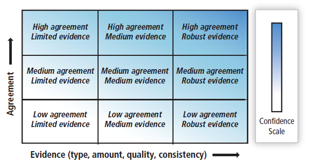
Defining Uncertainty
Credit: IPCC
The report is remarkable in how conservative are its predictions (to the point of drawing outrage from many climatologists). Every statement of fact is qualified with specific, well-defined terms to let the reader know how much evidence and how much consensus there is on the evidence behind the statement.
Scientific uncertainty can be partitioned in various ways, in which the details of the partitioning usually depend on the context. For instance, the process and classifications used for evaluating observational uncertainty in climate science is not the same as that employed to evaluate projections of future change. Uncertainty in measured quantities can arise from a range of sources, such as statistical variation, variability, inherent randomness, inhomogeneity, approximation, subjective judgement, and linguistic imprecision (Morgan et al., 1990), or from calibration methodologies, instrumental bias or instrumental limitations (JCGM, 2008).
In order to clearly communicate levels of uncertainty in the report, the IPCC has established strict definitions for the consistent use of equivocal language:
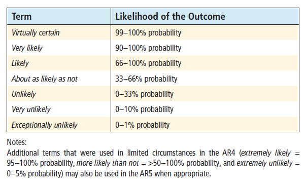
Likelyhood Scale
Credit: IPCC
Here are some examples of this equivocation in use:
- “Consistent with AR4, it is assessed that the early 20th century warming is very unlikely to be due to internal variability alone”
- “Estimates of the equilibrium climate sensitivity (ECS) based on observed climate change, climate models and feedback analysis, as well as paleoclimate evidence indicate that ECS is positive, likely in the range 1.5°C to 4.5°C with high confidence, extremely unlikely less than 1°C (high confidence) and very unlikely greater than 6°C (medium confidence).”
- “There is low confidence in basin-scale projections of changes in intensity and frequency of tropical cyclones in all basins to the mid-21st century. This low confidence reflects the small number of studies exploring near-term tropical cyclone activity, the differences across published projections of tropical cyclone activity, and the large role for natural variability.”
- “The net feedback from water vapour and lapse rate changes together is extremely likely positive and approximately doubles the black body response.”
- “It is extremely likely that human activities caused more than half of the observed increase in global average surface temperature from 1951 to 2010.”
- “For average annual [Northern Hemisphere] temperatures, the period 1983–2012 was very likely the warmest 30-year period of the last 800 years (high confidence) and likely the warmest 30-year period of the last 1400 years (medium confidence).”
This equivocation clearly defines what we know, don’t know, how clearly, and how confidently.
Perpetual Revision
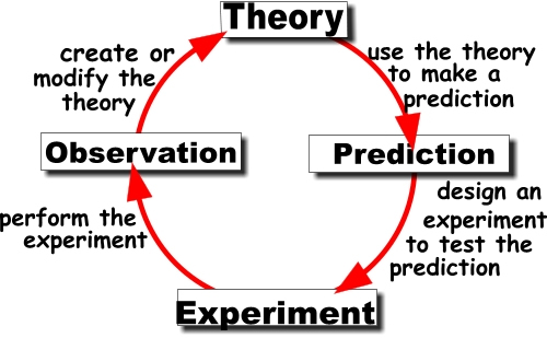
We are all dutifully acquainted with the scientific method as school children, but in the regular editions of the IPCC reports we get to see the process in action. Each new edition of the reports reviews the accuracy of predictions made in the previous reports. As the report cannot stress enough, modeling a system as complex as the Earth’s climate is an immense challenge. The models are hypotheses verifiable in how well they predict observed changes in the climate.
For example, in AR5 the observed rates of CO2 and sea-level rise fell right within the projections made in previous IPCC reports, but for the temperature record spanning 1998 to 2012 the “observed record lies within the range of the model projections, but on the lower end of the plume.” Temperatures increased, and the most recent decade was once again the warmest on record, but the rate of increase was on the lower end of the spectrum.*
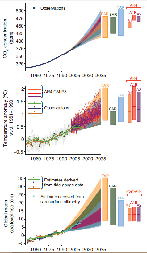
Previous IPCC Predictions versus Observations
Credit: IPCC
So the IPCC, as any good scientist would do, seeks to further resolve their models. What’s missing? What’s been given too much weight? Too little? Then there’s my favorite question, how accurate are your observations?
The IPCC First, Second and Third Assessment Reports (FAR, SAR and TAR) did not include the effects of volcanic eruptions and thus failed to include the cooling associated with the Pinatubo eruption. AR4 and AR5, however, did include the effects from volcanoes and did simulate successfully the associated cooling. During 1995–2000 the global mean temperature anomaly was quite variable—a significant fraction of this variability was due to the large El Niño in 1997–1998 and the strong back-to-back La Niñas in 1999–2001. The projections associated with these assessment reports do not attempt to capture the actual evolution of these El Niño and La Niña events, but include them as a source of uncertainty due to natural variability…
Aerosols from volcanoes, El Niño, La Niñas, the ocean absorbing thermal energy, water vapor absorbing energy, clouds and arctic sea ice reflecting energy back into space, the ratios of CO2, methane, and other chemicals in the atmosphere, and a myriad of other variables influence the model. By comparing the most recent observations against the model predictions, the researchers establish a new degree of confidence in their models:
There is very high confidence that models reproduce the general features of the global and annual mean surface temperature changes over the historical period, including the warming in the second half of the 20th century and the cooling immediately following large volcanic eruptions. Most simulations of the historical period do not reproduce the observed reduction in global mean surface warming trend over the last 10 to 15 years. There is medium confidence that the trend difference between models and observations during 1998–2012 is to a substantial degree caused by internal variability, with possible contributions from forcing inadequacies in models and some models overestimating the response to increasing greenhouse gas forcing. Most, though not all, models overestimate the observed warming trend in the tropical troposphere over the last 30 years, and tend to underestimate the long-term lowerstratospheric cooling trend.
Science: Hypothesize, Observe, Adjust, Repeat.
Transparency
A scientific observation that cannot be reproduced is an anomaly. Science is about repeatability. In this regard, the IPCC reports are very much in tune with the spirit of scientific inquiry.
In a section entitled “Fact Sheets,” the IPCC explains its author selection process, what scientific literature it will consider for inclusion, and its process for reviewing and correcting errors that get published. Each chapter in the report contains an extensive list of references so the reader can go to the primary sources and review the details and methodology of the original peer-reviewed journal articles.
Best of all, the IPCC makes all source data available through their Data Distribution Centre, where you can download large volumes of data and run simulations yourself. In 2009, I did just this, downloading the global temperature data and inputting it to Cornell’s Creative Machines Lab’s software Eurequa, which analyzes data and looks for trends. Not surprisingly, the software found a clear warming-trend over the past century when I had it analyze the data points used by the IPCC.
Education
If a scientist fails to share their observations with the world, is it science? No. Even more important than the IPCC’s transparency in its processes is its efforts to make its reports accessible to non-scientists. This does not mean that portions of the report are easy reading. In fact, I struggle with some of the terminology and explanations, but the report does try to define all terms and explain how we know what we know.
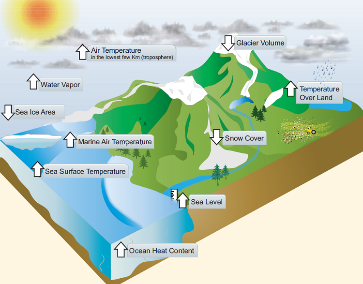
How Do We Know the World Has Warmed?
Credit: IPCC
Throughout the report, there are many interludes, brown boxes for “Frequently Asked Questions” (FAQs). These asides explain in simple terms answers to some of the most interesting scientific questions people have about Global Warming in general. By breaking up the informationally-dense report with these asides, the authors help keep the report from growing too tedious and make it more accessible to readers with little or no background in Earth Sciences.
Additionally, the authors have made the report more accessible by illustrating data into graphs and visualizations whenever possible.
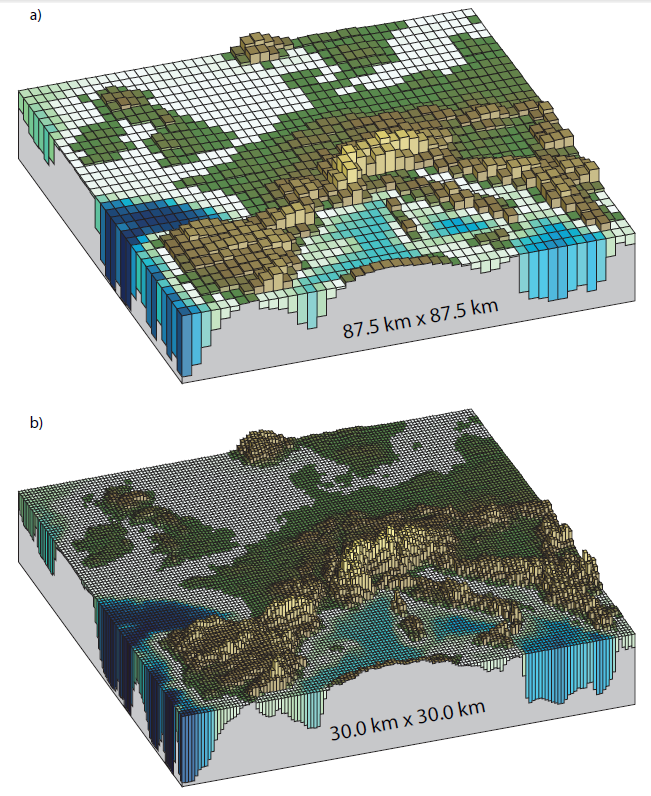
Comparing Model Resolutions
Credit: IPCC
In some cases, the same data is presented in two graphs so that the reader may understand its significance in different ways. Below, the report presents the observed temperature data in both a linear graph and broken up into decadal averages:
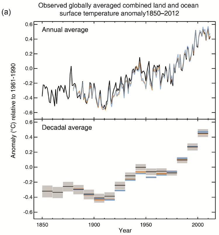
Alternate Presentations of the Same Data
Credit: IPCC
As with the way the IPCC report defines confidence and uncertainty, the authors also explain why they choose the graphs they do, and explain the balance that must be struck between showing the raw scatter-plot of temperature data-points over time versus smoothing out that variability to reveal the more easily understood averages over time:
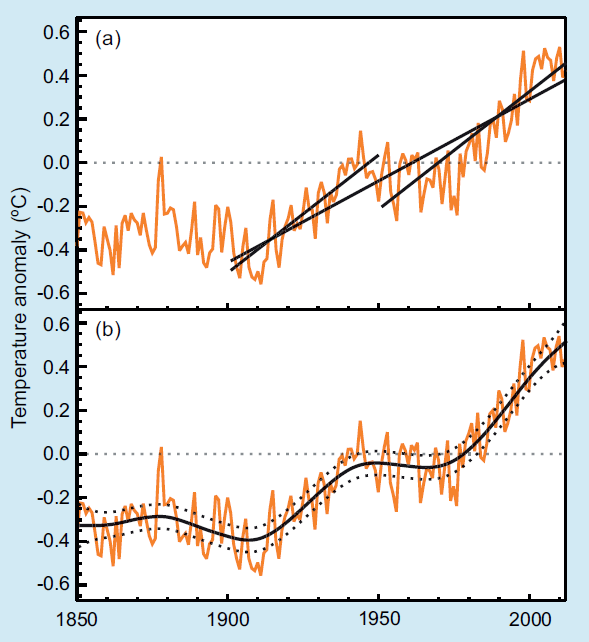
How Much Should the Data be Smoothed?
Credit: IPCC
Conclusion
The Earth’s Climate is a immensely complex system, but one we must understand in order to improve our chances of one day growing beyond this Spaceship Earth. The IPCC report is a remarkable attempt to achieve this understanding. By quantifying every statement of fact with a measure of certainty and confidence, it defines what we know and how well we know it. By constantly revisiting its previous assumptions against the most recent observations, each edition of the report grows clearer and more elucidating. By transparently exposing its processes and making its data available, anyone on planet Earth can review and publish their own analyses and critiques of the report’s findings. By defining terms, explaining concepts, and illustrating data in a variety of formats, the IPCC makes this freely-available report to anyone with an Internet connection also highly accessible to everyone, not just experts.
These are the characteristics of good science, and I look forward to the other reports scheduled for release this year. I will also look forward to the sixth, seventh, eighth editions and beyond to watch this field of scientific exploration grow and refine itself.